Building a Website for a Cat Cafe

My role:
I was the UX Designer and Researcher for this project, responsible for concept development, user research, wireframing, prototyping, and testing. Drawing inspiration from Seattle’s cat cafe community, I explored how local businesses communicate their missions, promote adoption, and handle reservations. This research informed my design decisions and helped me create a solution that feels both authentic and user-centered.
My Responsibilities:
User Research: Researched local cat cafes and their existing online platforms to identify strengths, gaps, and opportunities for improvement.
Persona Development: Created user personas to represent cafe visitors (cat enthusiasts, families, and potential adopters) to keep the design user-focused.
Information Architecture: Structured content clearly so users could easily navigate between learning about the cafe, booking visits, and exploring adoption events.
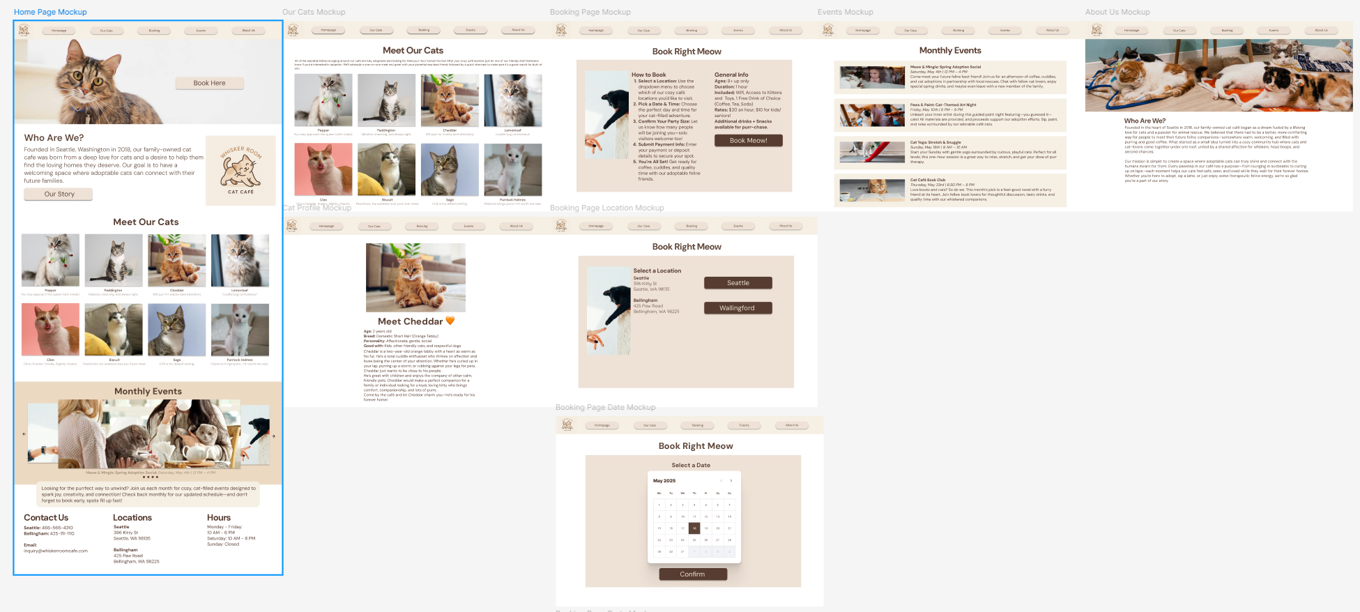
Wireframing & Prototyping: Designed low-fidelity wireframes and evolved them into high-fidelity prototypes to visualize the booking flow and site interactions.
Interaction Design: Built an interactive ticket booking system prototype to allow users to reserve time slots, simplifying what is often a clunky or confusing process.
Usability Testing: Conducted informal testing with peers to validate clarity of navigation and ease of booking, then iterated to improve flow and visuals.
For this project, my user research focused on understanding both the business side of cat cafes and the expectations of their visitors. I began by analyzing existing cat cafe websites, including local Seattle cafes, to identify patterns, strengths, and areas for improvement. I also conducted informal interviews with friends and family who have visited cat cafes to gather insights into their experiences, from booking a visit to interacting with the cats. This combination of competitor analysis and direct user feedback gave me a clearer picture of how a website could better meet user needs while reflecting the warm, welcoming mission of a cat cafe.

Process Reflection:
For Marcus, I focused on families. His needs revolve around transparency and convenience—he doesn’t want surprises when planning outings with kids. I emphasized family-specific concerns like age policies and group booking clarity.

The product:
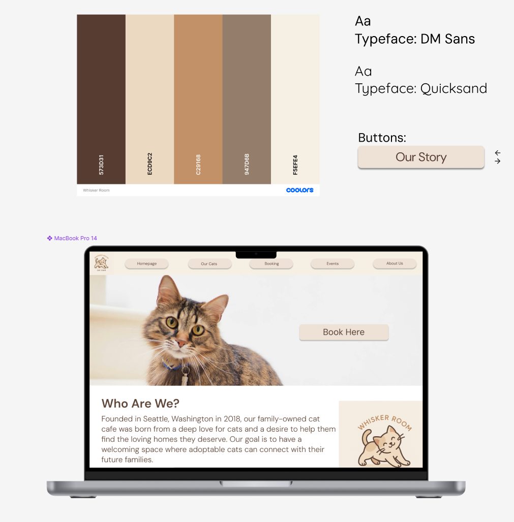
The Whisker Room is an imagined cat cafe concept based in Seattle, inspired by real cat cafes such as Cafe Neko. This project involved designing a modern, interactive website where visitors can learn about the cafe, explore adoption opportunities, and easily book tickets online for their visit.
Project duration:
This project took me about 2 months to complete.
The problem:
Cat cafes often struggle with outdated or minimal web presences, which can create barriers for users trying to reserve visits, learn about events, or engage with the mission of helping cats find homes. I wanted to address the challenge of creating a seamless, user-friendly experience that both reflects the cozy, welcoming environment of a cat cafe and makes booking intuitive.
The goal:
The goal of this project was to design an engaging and functional website that highlights the cafe’s mission, encourages adoption, and allows users to conveniently purchase tickets online, making the experience accessible from discovery to booking.
Understanding the User: User Research
User Journey Map
To better understand how different types of visitors would interact with The Whisker Room’s website, I created user journey maps for three personas. This process helped me visualize each step a user might take, from discovering the cafe to booking a visit or exploring adoption opportunities, all while capturing their goals, emotions, and frustrations along the way. By mapping these experiences, I was able to identify common pain points, such as unclear policies or confusing booking flows, and highlight opportunities for improvement. The journey maps not only clarified the needs of potential users like young professionals, families, and adopters but also guided my design decisions to ensure the website experience was intuitive, welcoming, and aligned with both the business goals and user expectations.

Starting the design
Going Forward…
The Takeaways
Impact:
Designing The Whisker Room website gave me the chance to bring an imaginary cat cafe to life while also creating something that felt functional, inviting, and community-driven. By refining the booking flow, ensuring clear navigation, and polishing visual hierarchy, I was able to design a space where users could easily engage with events, book visits, and explore adoption opportunities. This project showed me how thoughtful design can directly support a mission—helping cats find loving homes—while also creating a delightful online experience.
What I learned:
As someone new to UX design, this project was a huge learning experience. I realized just how much every detail matters—whether it’s the size of a button, the consistency of typography, or the behavior of a call-to-action. Each interaction truly counts and can make the difference between a smooth, enjoyable flow and a frustrating one. Working on The Whisker Room was both fun and rewarding, and it solidified my passion for UX by showing me how design decisions translate into real user impact. It also gave me the confidence to see that I can merge creativity with problem-solving to make meaningful experiences.

Process Reflection:
When designing Emily’s journey, I thought about young professionals who are tech-savvy, value convenience, and want a stress-free experience. I considered her frustrations with outdated booking systems and her need for a mobile-friendly, modern design. Her journey map reflects her desire for efficiency and emotional relief.

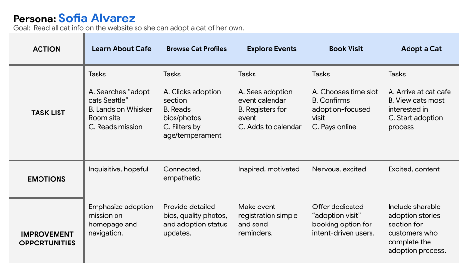
Process Reflection:
Sofia’s journey is centered on adoption. I imagined her perspective as someone who wants to form an emotional connection before committing. Her pain points revolve around poor adoption info online, so I made sure her journey highlights cat profiles, updated details, and trust-building content.
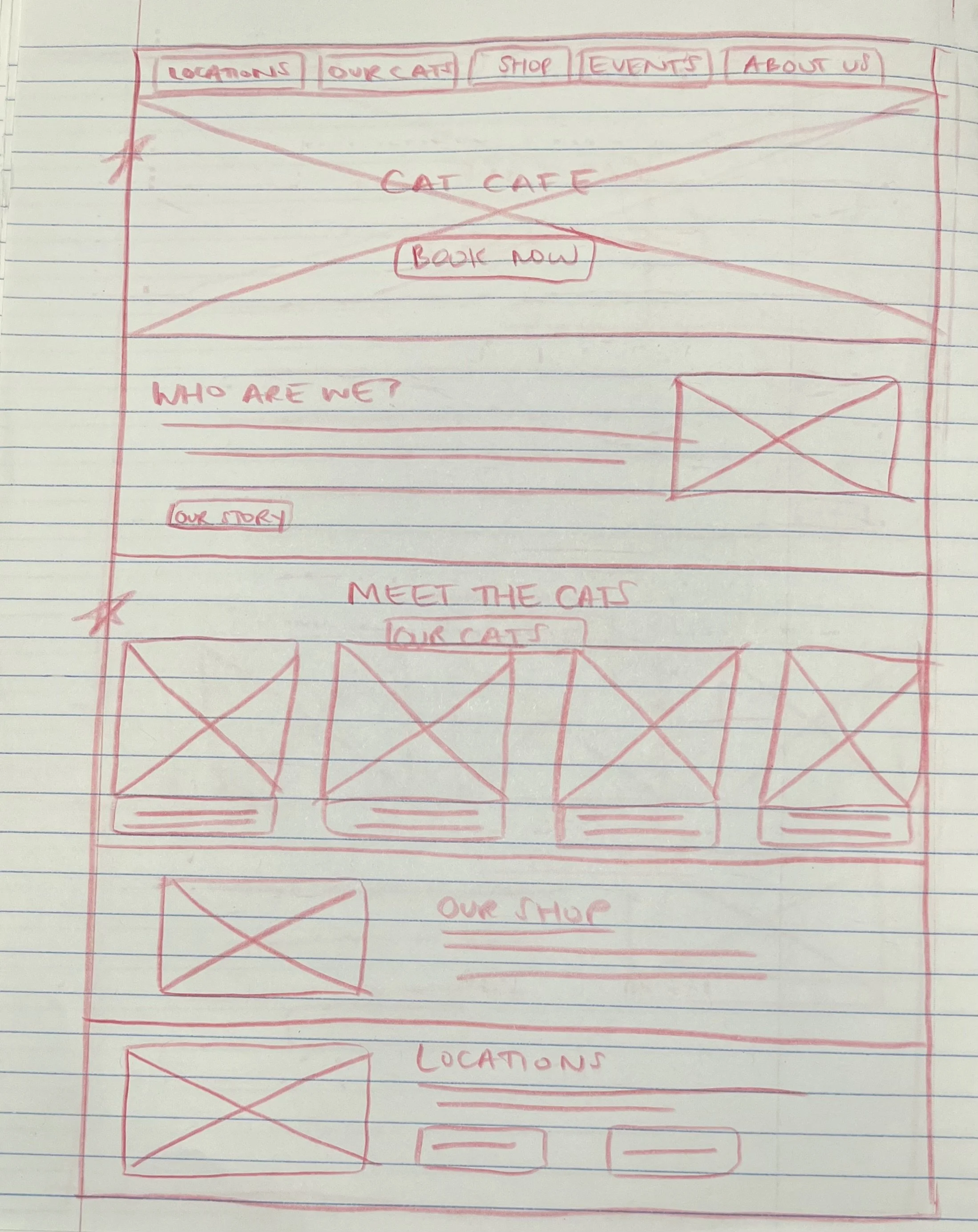
I aimed to make a wireframe that was simple to navigate, but retained enough information for users to clearly book and view all the different cats.

Throughout the iteration process, I refined the booking and information flow to make the website more intuitive. After receiving feedback from testing, I made an effort to create clearer navigation between booking, menu, and event details.

Refining The Design
Usability Testing Findings
To evaluate the effectiveness of my design for The Whisker Room website, I conducted informal usability testing with peers. Testers provided valuable feedback on both strengths and areas for improvement:
Positive Feedback
The overall flow of the site felt smooth and intuitive.
Navigation was described as clear and easy to follow.
The contrast between background and foreground elements provided strong accessibility and readability.
The visual hierarchy was clear across all pages, helping guide users through content naturally.
Areas for Improvement
Typography Consistency: Testers noted inconsistencies in type sizes across the site and recommended establishing a stricter style guide with standardized header levels and one consistent body size.
CTA Behavior on Homepage: The call-to-action button on the homepage did not behave as expected, which created some confusion around the primary action.
Implemented Changes
Following the feedback, I refined the typography system by creating a clear style guide with consistent header and body text sizes, resulting in a more cohesive design. I also updated the homepage CTA behavior to improve clarity, ensuring it flowed better with the layout and functioned as intended. These adjustments improved overall usability and created a smoother, more professional experience for users.

Next Steps Include…
Pain Points
Confusing Booking Systems - Many sites have outdated or overly complicated reservation processes, making it difficult to know what’s available or to complete a booking smoothly.
Unclear Policies - Important details such as age restrictions, health/safety guidelines, or group booking options are often buried or missing, leaving users uncertain before visiting. Many people do not know what to expect when booking as this type of establishment welcomes a lot of first time customers.
Cluttered or Outdated Design - Some websites feel visually overwhelming or outdated, which can make users doubt the professionalism or trustworthiness of the business.
Lack of Adoption Information - Cafe websites often fail to provide updated profiles, bios, or event details about adoptable cats, limiting users’ ability to connect before visiting.


Accessibility Considerations

Paper Wireframes