Building a Digital Menu for a Street Food Vendor

My role:
My goal was to design something that felt intuitive, welcoming, and accessible to everyone. I focused heavily on accessibility and usability so that anyone, regardless of age, ability, or tech comfort level, could place an order with ease.
My Responsibilities:
User Research: Conducted observational research and informal interviews with frequent customers to understand pain points in the ordering experience.
Wireframing & Prototyping: Developed low- and high-fidelity wireframes using Figma, followed by interactive prototypes for testing.
Usability Testing: Ran remote and in-person usability tests with diverse users, including individuals with visual impairments and older adults, to ensure accessibility and clarity.
Visual Design: Incorporated the brand's casual, street-style vibe into the interface while maintaining simplicity and clarity
For user research, I started with informal interviews and observations, speaking with neighbors, friends, and fellow customers who frequently visited Tacos Chukis. I assumed most users just wanted speed and convenience, but the feedback showed a broader range of needs, like the desire to customize orders easily, the importance of clear pickup instructions, and a preference for a menu that felt less cluttered or overwhelming. These insights helped me prioritize simplicity, accessibility, and clear communication throughout the design.
The product:
I designed a mobile app for a local food truck in Seattle.
Project duration:
This project took me about 6 months to complete.
The problem:
Tacos Chukis, a beloved local Mexican street food spot in Seattle, had no mobile ordering system. I wanted to create an accessible, efficient way for customers to browse the menu, customize their orders, or skip the wait.
The goal:
Create an intuitive, mobile-friendly digital menu that allows customers to place orders online for in-store pickup—improving the overall dining experience while ensuring accessibility for all users..
Understanding the User: User Research
Pain Points
Limited Accessibility Features
Some users had difficulty with small touch targets, low contrast, or unclear text, especially on mobile devices. I prioritized accessibility by increasing touch target sizes, using high-contrast colors, readable fonts, and screen reader-friendly structures to ensure a usable experience for all.

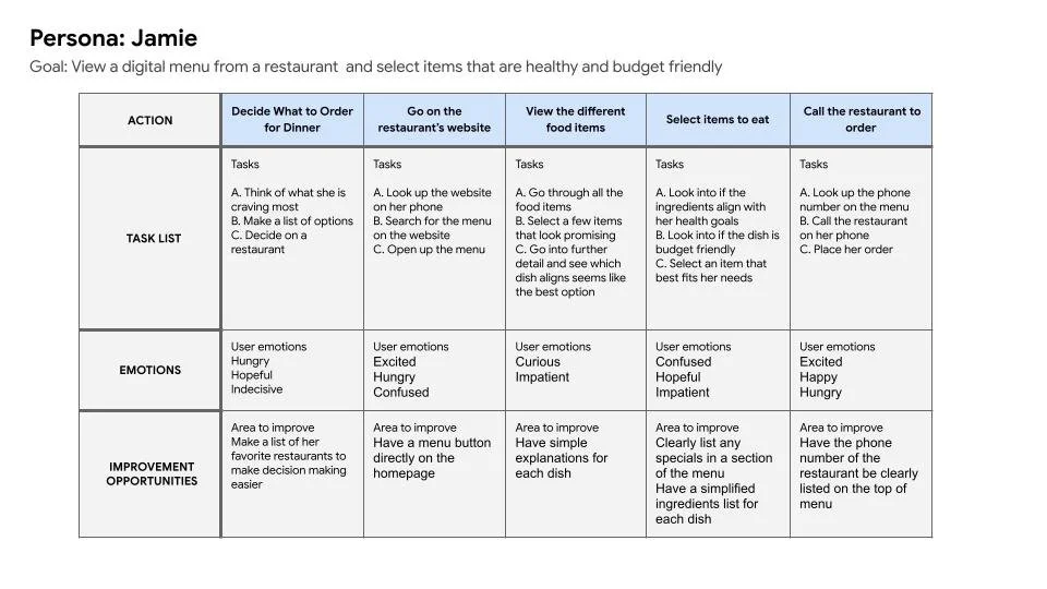
User Journey Map
When mapping out the user journey, I focused on a primary goal: helping users easily view the digital menu and find budget-friendly, healthy options without feeling overwhelmed. I considered the mindset of a customer who may be in a rush, health-conscious, or trying to stay within a budget—all while navigating a busy restaurant environment. My thought process included reducing friction points by creating clear menu categories and highlighting “specials of the day picks” with visual tags. I wanted the experience to feel intuitive and reassuring, guiding users from landing on the menu to placing an order with minimal effort and maximum clarity.
Starting the design
Paper wireframes
Digital wireframes
Low-fidelity prototype
Usability studies
Going Forward…
The Takeaways
Impact:
The final design was well-received during testing, with one participant sharing that they loved how “organized and easy it was to navigate,” and how the visuals and layout felt “clean and consistent from start to finish.” I interpreted this feedback as generally positive, and that the app achieved its goal of delivering a smooth, intuitive, and visually cohesive ordering experience.
What I learned:
Throughout this project, I learned the importance of balancing visual design with functionality. Initially, I was heavily focused on creating a beautiful, brand-aligned aesthetic, but user feedback quickly showed me that clear, straightforward navigation was what truly made the experience enjoyable and effective. Prioritizing usability—especially for users with different needs and tech comfort levels—helped me grow as a designer and reinforced that great design is about more than just how something looks; it’s about how it works for real people.
Difficult Checkout Process
Testers found with many other food ordering apps, the checkout flow too long and confusing, with unclear confirmation steps.
I streamlined the checkout process by reducing the number of steps and adding clear, friendly confirmation messages to increase confidence and reduce drop-offs.
Confusing or Cluttered Menu Navigation
Users often felt overwhelmed by too many options presented at once or unclear category labels.
This insight guided me to organize the menu into easily navigational sections with clear icons and labels, making it easier for users to browse and find what they want quickly.

I aimed to make a wireframe that was simple to navigate, with a clear button for specials and what’s popular. I wanted to also make sure the checkout section was intuitive.


Throughout the iteration process, I constantly tried to find ways to make the flow more user friendly. I had to add some interactions that were missing along the way. It was a great learning experience.

Refining The Design
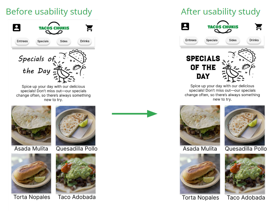
While designing the high-fidelity mockups, my goal was to create a vibrant, inviting look that reflected the personality of the restaurant while staying easy to navigate. Initially, I used a handwritten-style font to give it a casual feel, but user feedback revealed it felt out of place and slightly hard to read. Based on that input, I switched to a more culturally aligned, bold, and legible typeface that better captured the spirit of a Mexican street food experience while maintaining clarity and visual consistency throughout the app.

Mockups


Next Steps Include…
Limited Customization Options
Users struggled to customize their order, especially when trying to remove ingredients or make special requests.
I introduced modifier buttons, and a checkbox section for each item to allow for quick and flexible customization.