Building a Website/App for a Local Art Museum
My role:
As the UX Designer, I led the end-to-end design process, from research and persona creation to wireframes, user flows, and prototypes. My goal was to design an experience that not only meets functional needs but also conveys the artistic essence of the museum in a way that is approachable, modern, and inclusive.
My Responsibilities:
User Research – Conducted usability studies to identify visitor pain points and opportunities for improvement.
Competitive Audit – Analyzed other museum websites and apps to evaluate industry standards and uncover gaps SAM could address.
Persona & Journey Mapping – Defined user personas and developed journey maps to guide design decisions based on real needs.
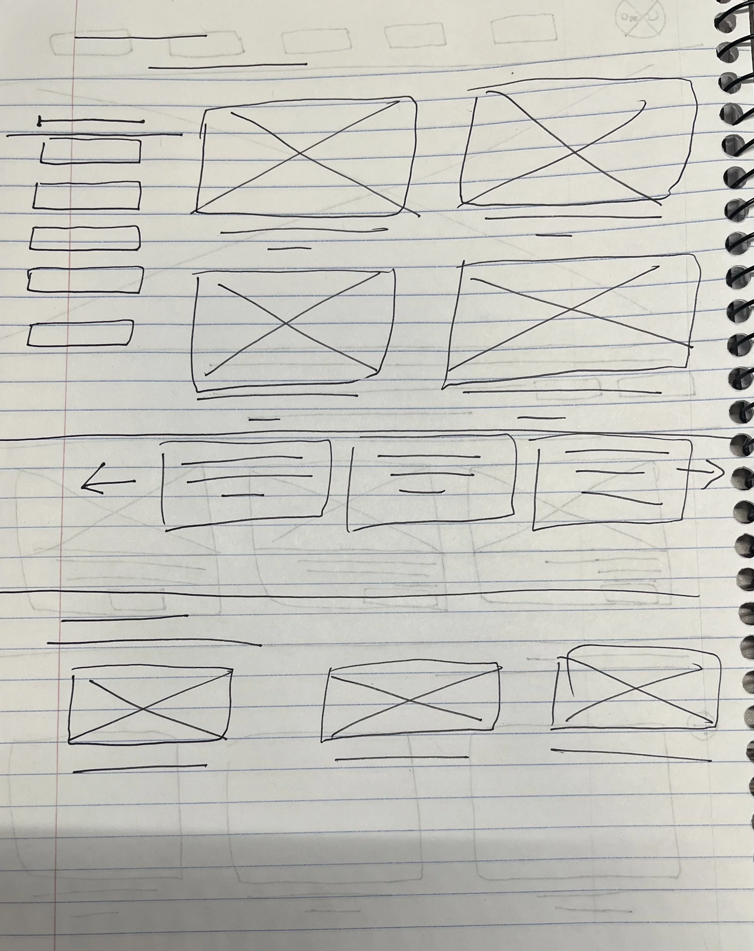
Wireframing & Prototyping – Created low- and high-fidelity wireframes, user flows, and prototypes to visualize and test solutions.
Accessibility Design – Incorporated accessibility guidelines (contrast, alt text, screen-reader compatibility) to ensure inclusivity across web and mobile platforms.
Usability Testing – Conducted feedback sessions and iterative testing to refine designs, enhance usability, and improve overall user satisfaction.
Three personas guided the design:
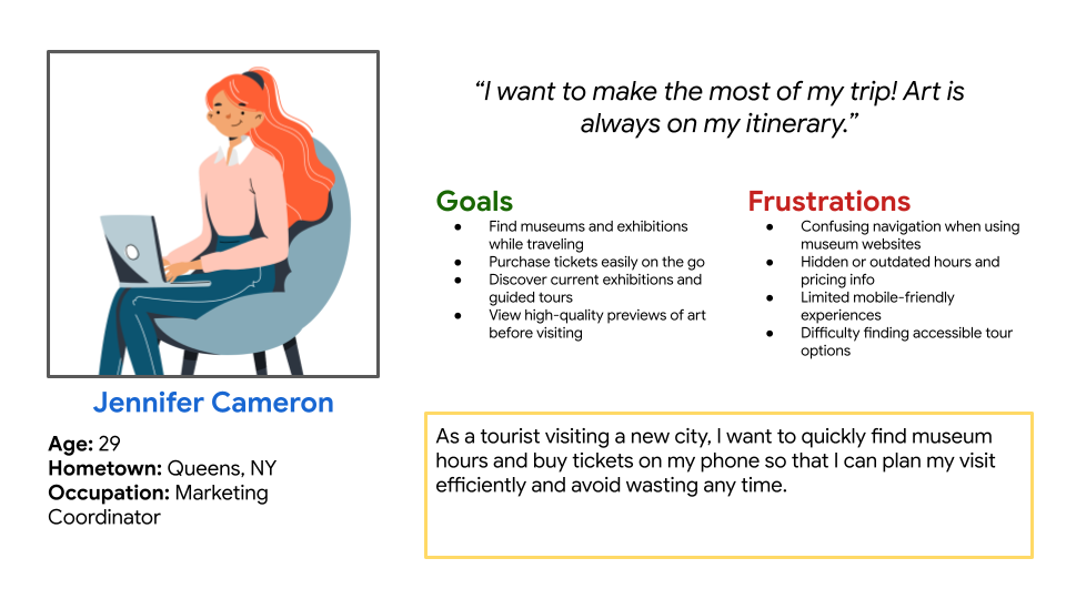
Jennifer Cameron: A busy parent seeking quick visit planning tools.
Sydney West: A young professional looking for engaging, educational resources.
Walter Young: A retiree who values clarity and accessibility.
User journey maps helped identify key actions (like booking tickets or browsing exhibits) and pain points at each stage, shaping solutions to reduce friction.
Process Reflection:
Sydney’s persona emphasized the challenges of balancing family needs with personal interests. As a parent, her goal was to plan visits without stress, while also ensuring the experience is enjoyable for everyone. Designing for Sydney pushed me to streamline navigation, simplify ticketing, and clearly present family-friendly events, so parents like her can focus on creating meaningful experiences at the museum rather than troubleshooting the website.

The product:
The project is a responsive website and mobile app for the Seattle Art Museum, designed to improve how visitors interact with the museum online. The product focuses on showcasing exhibitions, events, and collections while also providing essential visitor information and scheduling features. By integrating an intuitive design, the product aims to enhance the digital experience of both local and international visitors, making art more accessible and engaging.
Project duration:
This project took me about 2 months to complete.
The problem:
Many users struggle to navigate existing museum websites due to cluttered layouts, confusing navigation, and lack of mobile optimization. Visitors often find it difficult to quickly locate event information, purchase tickets, or plan their visit. This results in frustration, lost engagement, and missed opportunities for the museum to connect with its audience.
The goal:
The goal of this project was to design a clean, user-friendly, and inclusive platform that simplifies access to museum resources. The design focuses on improving navigation, streamlining the ticketing and scheduling process, and highlighting exhibitions in a visually appealing way. Ultimately, the aim was to create a digital experience that reflects the creativity and accessibility of the museum itself.
Understanding the User: User Research
User Journey Map
To create meaningful user journey maps, I began by developing detailed personas- Jennifer Cameron (a tourist), Sydney West (a parent), and Walter Young (a senior member)- based on user needs, goals, and behaviors. I mapped each of their experiences across five key stages: Awareness, Consideration, Booking, Visiting, and Post-Visit. For each stage, I identified their actions, thoughts, emotions, and pain points, then uncovered opportunities for design improvements. This process helped reveal where the app and website could better support users with diverse needs and contexts.

Starting the design
Going Forward…
The Takeaways
Impact:
The redesigned Seattle Art Museum website and app created a more inclusive and engaging digital experience for visitors. By simplifying navigation, improving accessibility, and enhancing visual consistency, users could now find essential information and complete key actions—like exploring exhibitions or purchasing tickets—more efficiently. Usability testing confirmed higher user satisfaction, with participants noting that the design felt modern, easy to use, and reflective of the museum’s creative identity.
What I learned:
This project reinforced the importance of grounding every design decision in user feedback and accessibility principles. I learned how even small adjustments—like improving contrast or refining typography—can significantly impact overall usability and user trust. It also strengthened my ability to balance visual design with functionality, ensuring the final product not only looked beautiful but truly served the needs of its diverse audience.


Process Reflection:
Jennifer’s persona highlighted the importance of creating an intuitive, modern experience for young professionals who want to explore art and events in their limited free time. Her needs reminded me to design with efficiency in mind—making sure information is easy to scan, schedules are clear, and booking a visit feels effortless. This focus helped me craft a sleek and user-friendly design that fits her fast-paced lifestyle.


Process Reflection:
Walter’s perspective underscored the importance of accessibility and clarity. His frustrations with confusing layouts and overwhelming text reminded me that great design must serve all users, regardless of technical comfort. By prioritizing readability, high-contrast visuals, and intuitive flows, I ensured that the final product was inclusive and supportive for visitors like him.
I aimed to make a wireframe that provided museum goers with all the information they could need in a concise format.


Refining The Design
Usability Testing Findings
After conducting usability testing sessions with participants representing a mix of first-time visitors, frequent museum-goers, and older users, several key insights emerged. Overall, users appreciated the clean visual design, clear typography, and improved navigation compared to the original Seattle Art Museum website. However, testing also revealed opportunities to refine the ticketing flow and accessibility features to create an even smoother experience. These insights directly informed the final design refinements.
Positive Feedback
Users found the homepage layout visually engaging and easy to scan.
Participants appreciated the responsive design.
The consistent visual hierarchy and color palette were described as “modern and fun” with the use of pastels.
Areas for Improvement
Typography Consistency: Testers noted inconsistencies in type sizes across the site and recommended establishing a stricter style guide with standardized header levels and one consistent body size.
The ticket purchase confirmation felt unclear and needed stronger visual feedback.
Implemented Changes
Based on user feedback, I refined several design elements to improve overall usability and visual consistency. The ticket confirmation screens were redesigned with clearer messaging and visual feedback to reduce confusion after purchase. Additionally, I addressed inconsistencies in the typeface across pages to create a more cohesive and polished visual identity for the website.
Pain Points
Difficult Mobile Navigation
Users struggled with clunky menus and unresponsive layouts.
Solution: I designed a clean, mobile-first layout with simplified navigation and easy access to key actions.Lack of Clear Event Details
Exhibit descriptions lacked clarity, making decision-making harder.
Solution: I created consistent exhibit pages with visuals, clear descriptions, and dates.Confusing Ticketing Process
Booking flow was long and unclear, especially for families and members.
Solution: I streamlined ticket selection with filters (e.g., family, member, senior) and a step-by-step booking interface.Missing Accessibility Features
Seniors had trouble reading content and navigating complex interfaces.
Solution: I applied accessibility best practices—larger fonts, high contrast, intuitive layouts, and readable type.Limited Practical Information
Users couldn’t easily find info on parking, hours, or accessibility.
Solution: I added a centralized “Visitor Info” section with FAQs, maps, and filterable search for accessibility features..
Accessibility Considerations